
A wide catalogue of things that all look alike
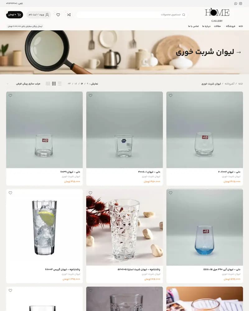
Glassware is a hard catalogue to browse. Fifty tumblers photographed the same way on the same background are hard to tell apart, and the thing that separates them — the size, the brand, the set they belong to — is exactly what a grid of thumbnails throws away.
The practices this build came out of.
01E-commerce
02WooCommerce development
03RTL design
Category first, brand second
The store opens on its ten categories rather than on products, so the first choice a visitor makes is the one that narrows the catalogue most. Inside a category, listings carry the brand and the piece in the product name, its category beneath it and the price in Toman below that, so three thumbnails of near-identical glasses still read as three different products.
The controls a shopper actually uses
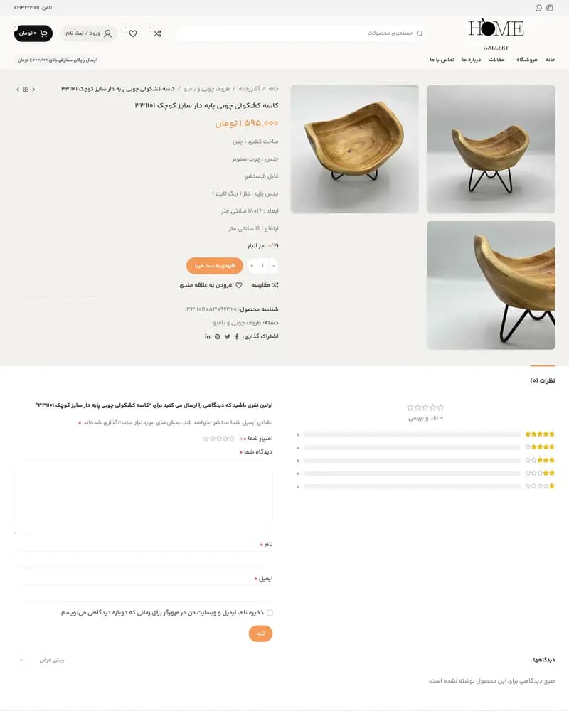
Sorting, page size and a grid-or-list switch sit above the listing; wishlist and compare sit on the card. The free-shipping threshold is stated in the header rather than discovered at checkout, and the whole storefront is right-to-left Persian rather than a left-to-right theme with the text flipped.
Traffic, revenue and conversion figures belong to the client, so we do not publish them. What follows is what the delivered build contains.