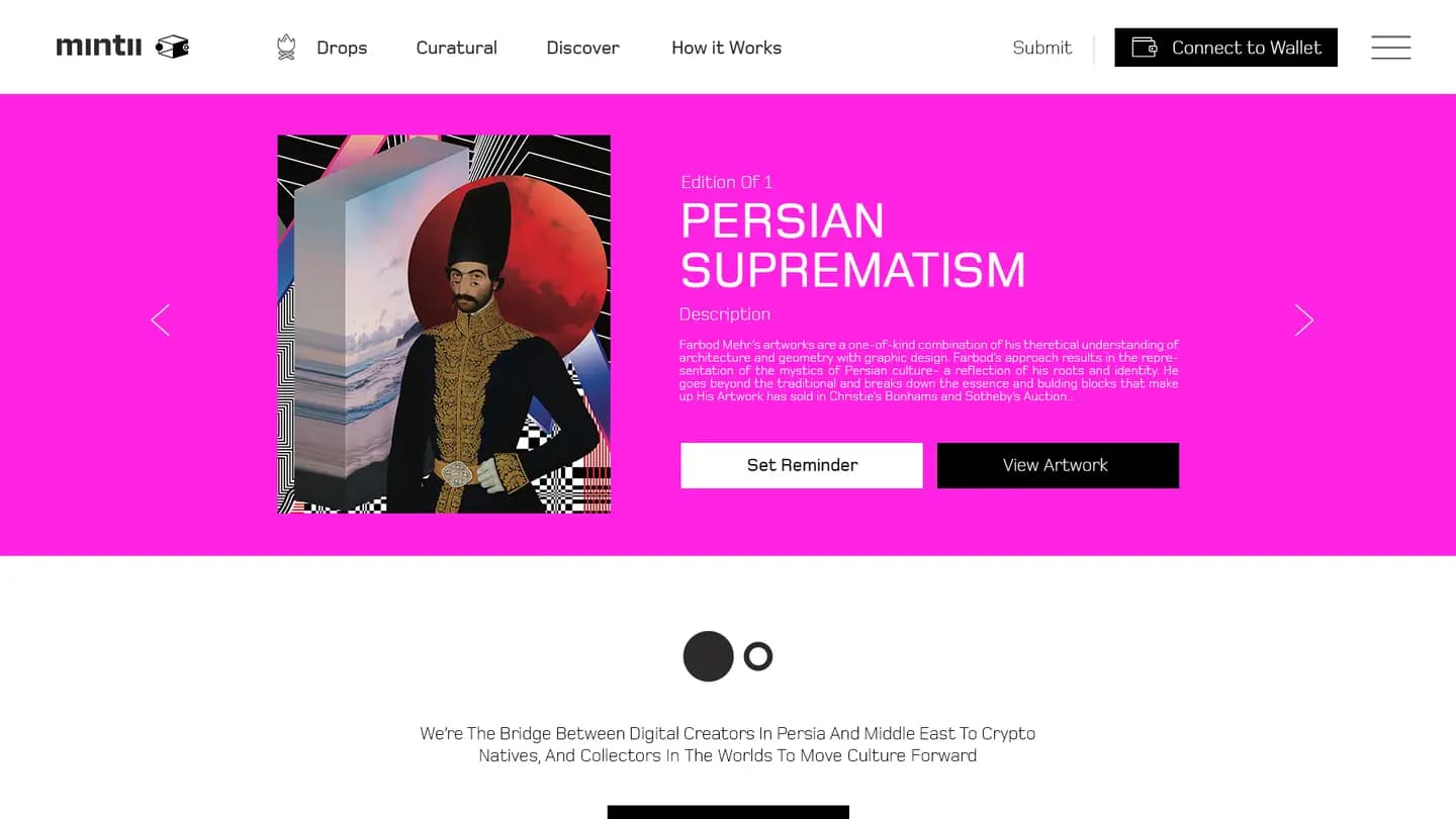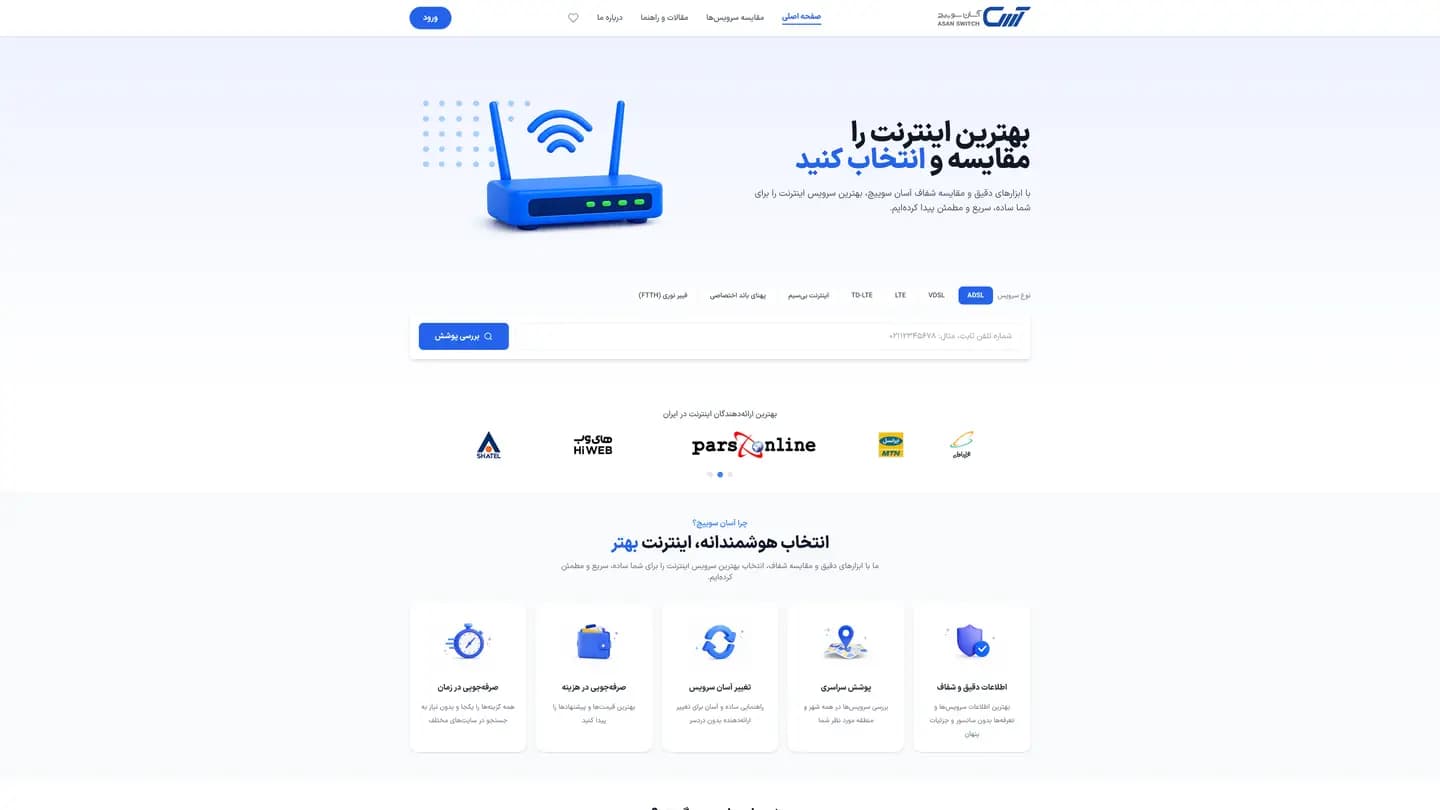
Thirty providers, one decision
Iranian broadband is sold as ADSL, VDSL, fibre, TD-LTE, wireless and dedicated bandwidth by more than thirty companies, each with its own tariff sheet, its own traffic rules and its own definition of coverage. The data is naturally tabular and changes constantly, and most people meet it for the first time on a phone. A comparison site that simply reproduced the tables would have reproduced the confusion.
The practices this build came out of.
01Product & UX design
02Front-end architecture
03Web application
Normalise the data, then render it
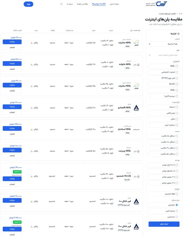
Provider, plan and tariff data was modelled into a single shape before any interface existed, so filtering by service type, speed, price and traffic behaves identically no matter which company the plan came from. The site is a Next.js App Router build using React Server Components, which keeps pages server-rendered for search while navigation stays application-fast. Coverage lookup by line or city, user accounts and saved comparison lists all read the same dataset.
Dense tables that survive a small screen
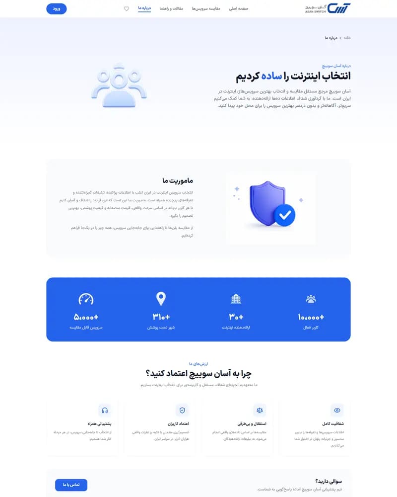
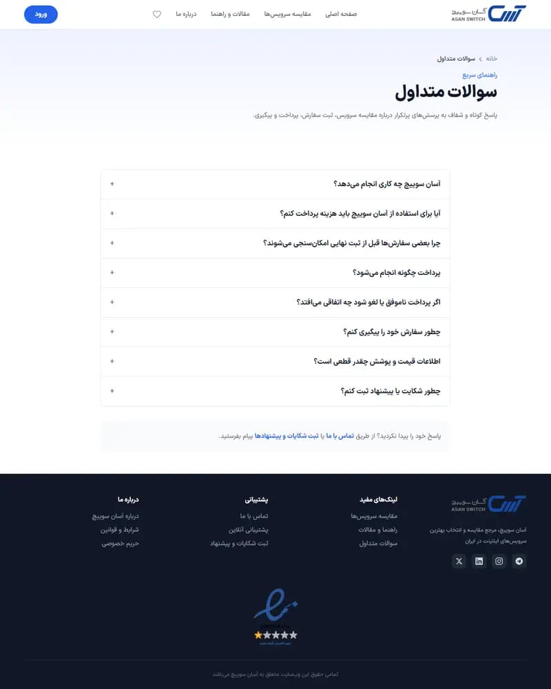
A guided, step-by-step flow carries people who do not want a table at all, and the tables themselves lean on a strong numeric hierarchy so price, speed and traffic stay scannable when the layout collapses. The whole interface is right-to-left. A library of guides and FAQs sits alongside the comparison engine and carries the organic search traffic that brings people to it.
Traffic, revenue and conversion figures belong to the client, so we do not publish them. What follows is what the delivered build contains.