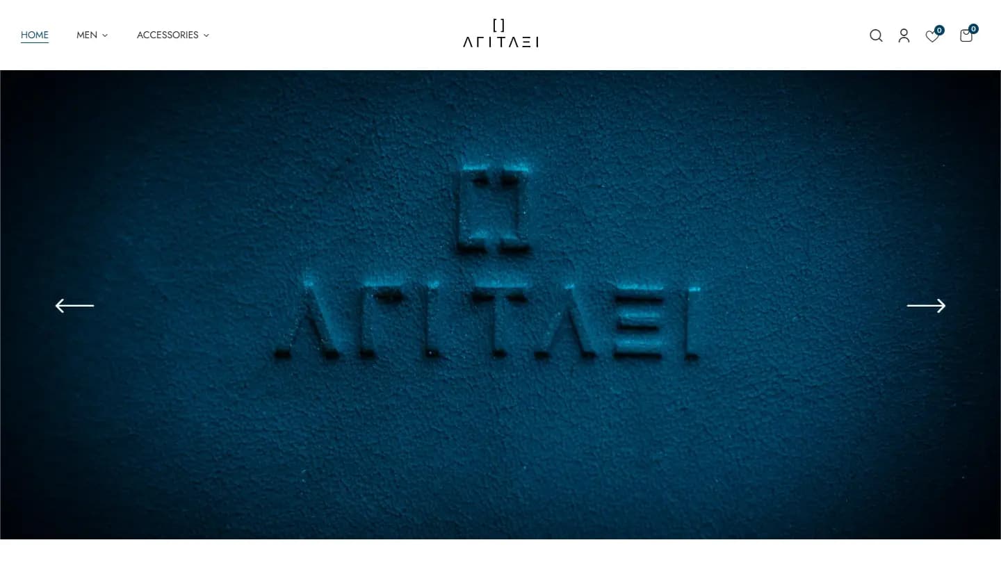
A brand statement that also has to sell
A fashion label is judged on the first screen. The store had to read as the brand rather than as a catalogue, while still supporting the ordinary work of online retail: categories, variants and sizes, accounts, wishlist, search and a checkout people trust.
The practices this build came out of.
01E-commerce
02WooCommerce development
03Editorial UI

Retail machinery under an editorial surface
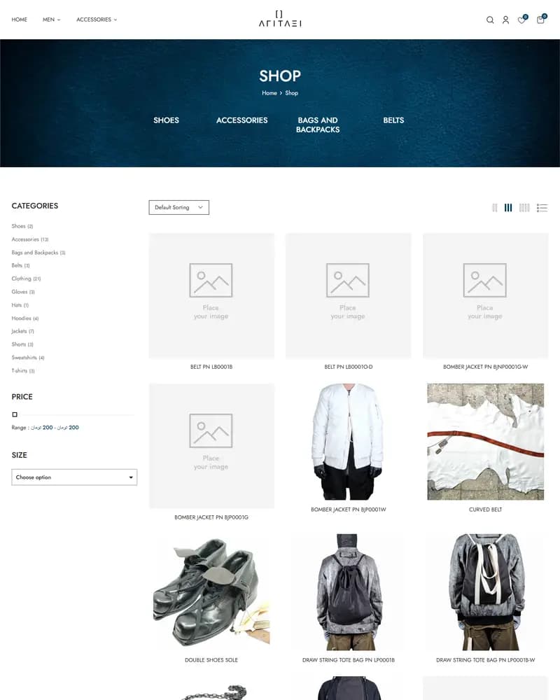
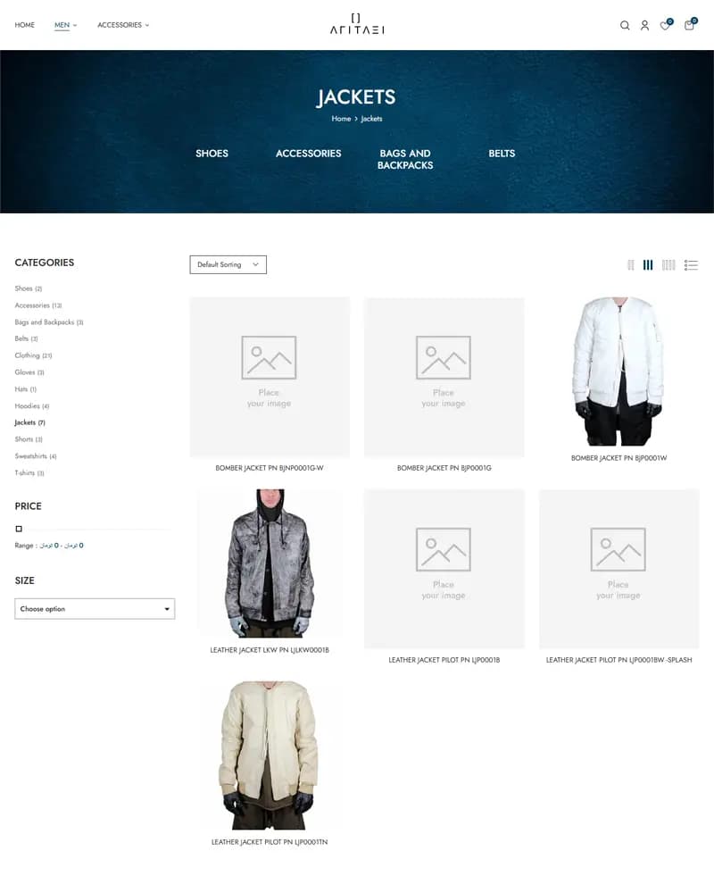
The store runs on WordPress and WooCommerce with a customised child theme, variation swatches, wishlist, customer accounts and a full checkout. Discovery is handled by a category mega-menu and seasonal campaign blocks on the homepage; GSAP-driven motion, hover previews and quick-view keep browsing fluid without adding a page load.
Monochrome, and mostly photography
High-contrast dark product photography, minimal typographic branding and generous negative space give the collection a lookbook rhythm. The mobile flow was designed first, because that is where the buying happens: a sticky header keeps cart and account within reach without competing with the imagery.
Traffic, revenue and conversion figures belong to the client, so we do not publish them. What follows is what the delivered build contains.