The subject is the argument
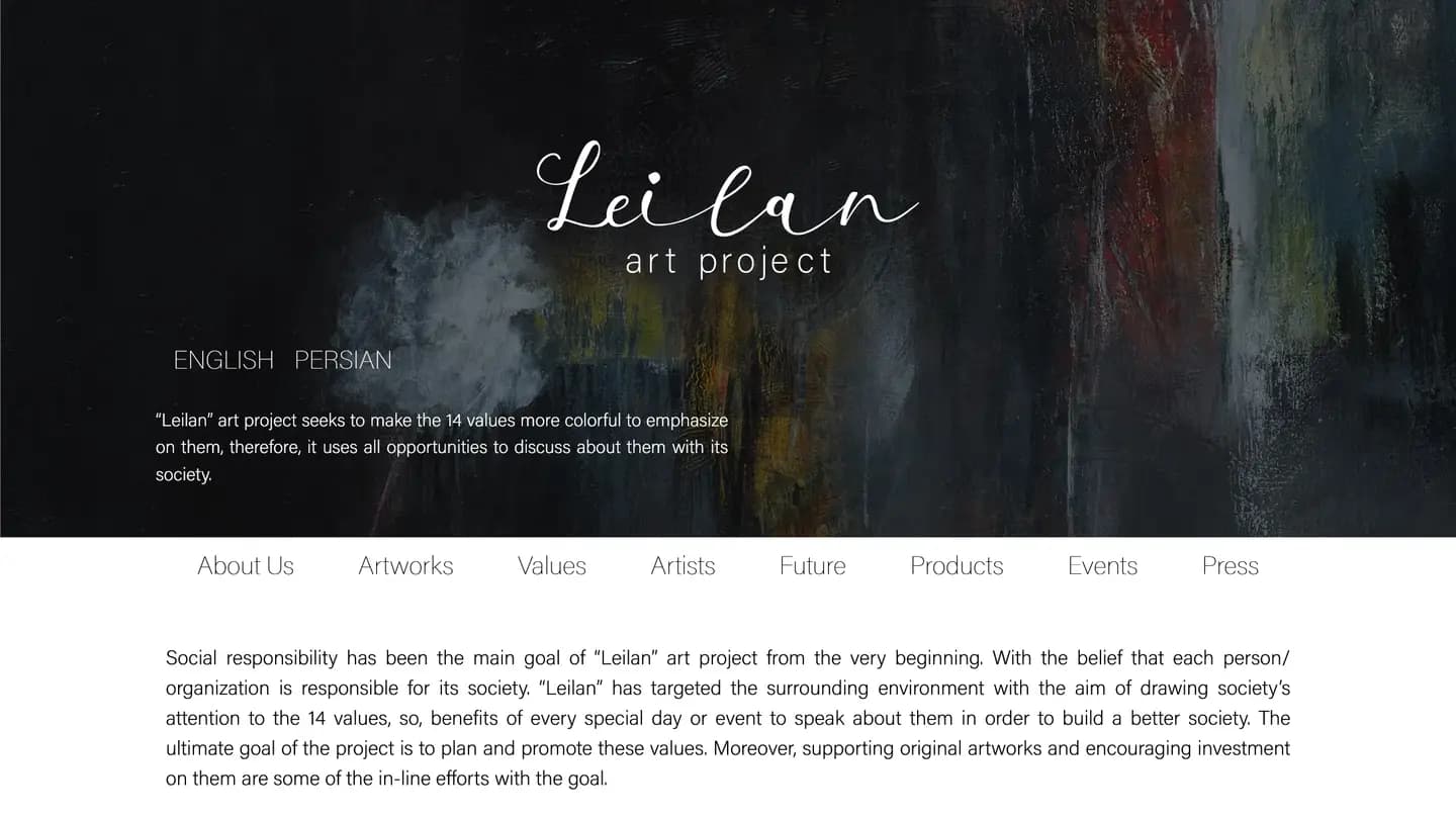
Leilan is not a gallery with a programme attached; it is a set of fourteen values that artists are invited to answer. The site has to carry that idea before it carries any artwork, and then hold artworks, artists, events and press underneath it without the idea disappearing behind a grid of images.
The practices this build came out of.
01UI/UX
02Editorial design
03Multilingual development
Editorial pacing over gallery grid
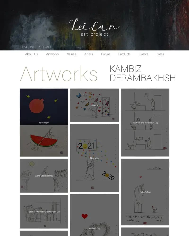
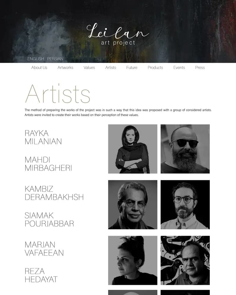
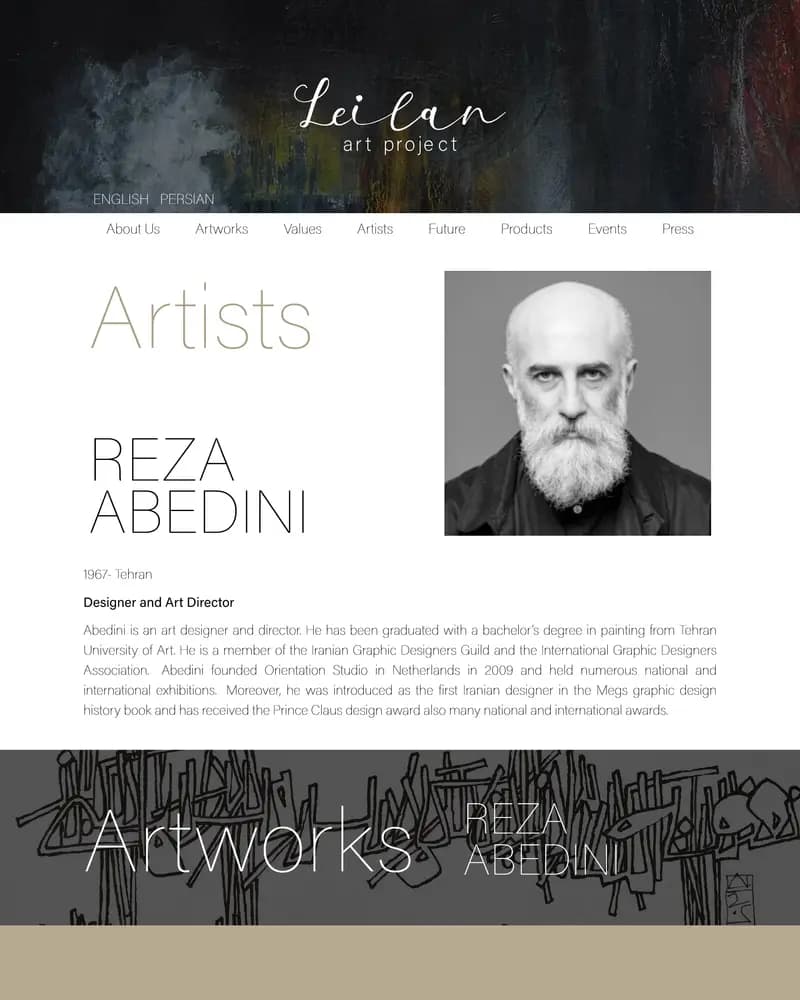
Long full-bleed bands of artwork alternate with set columns of text, so a reader moves between looking and reading rather than scrolling one uninterrupted wall of thumbnails. Artworks, Artists, Values, Events and Press are separate destinations, and an artist page gives a single name the room a portrait deserves.
Two languages, one composition
English and Persian are offered from the first screen and every page exists in both, with the Persian edition laid out for right-to-left reading rather than mirrored from the English. The palette stays out of the way throughout — black, bone and a warm neutral — because every page is carrying someone else’s colour.
Traffic, revenue and conversion figures belong to the client, so we do not publish them. What follows is what the delivered build contains.