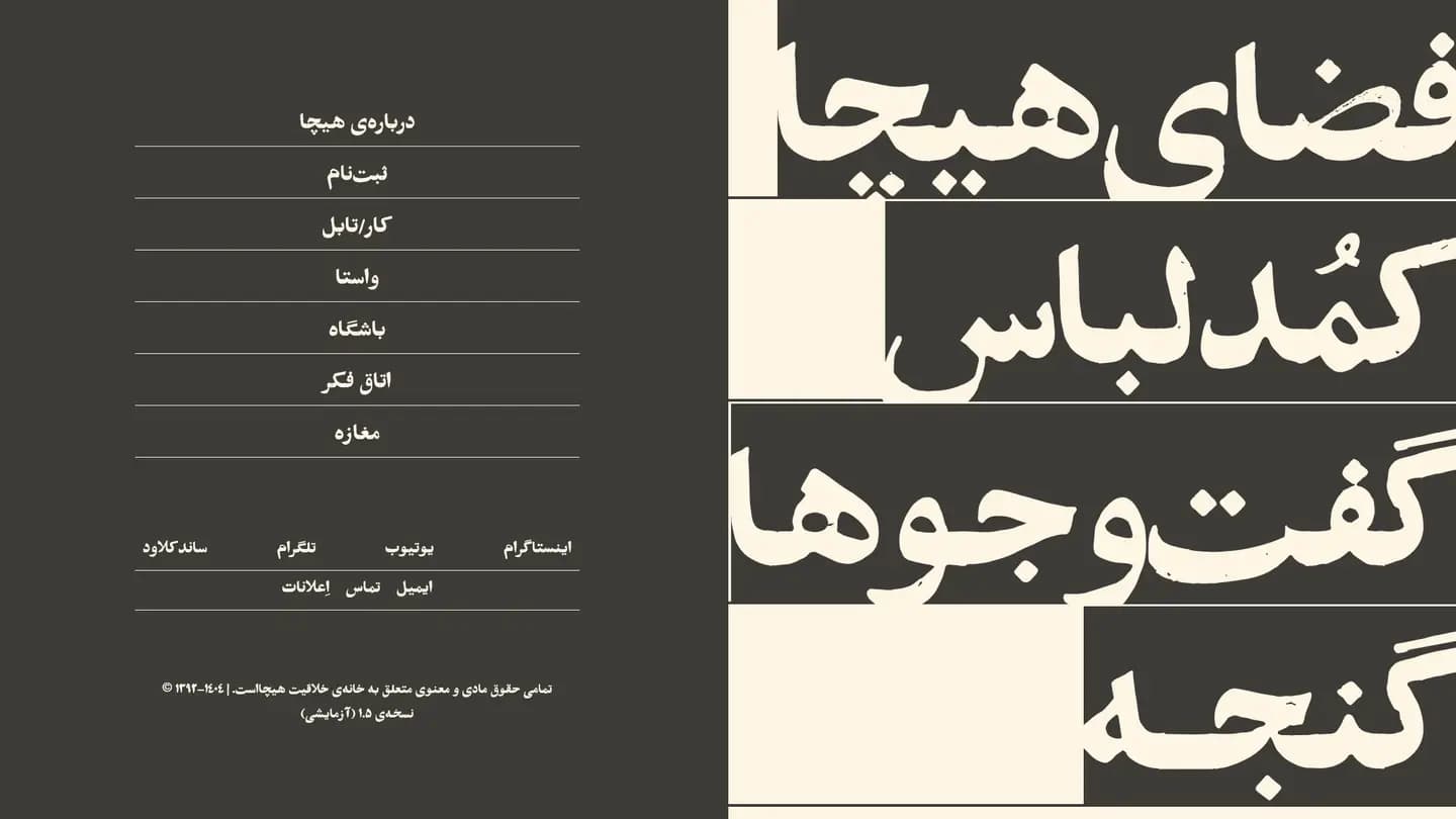
Minimal, and still full of content
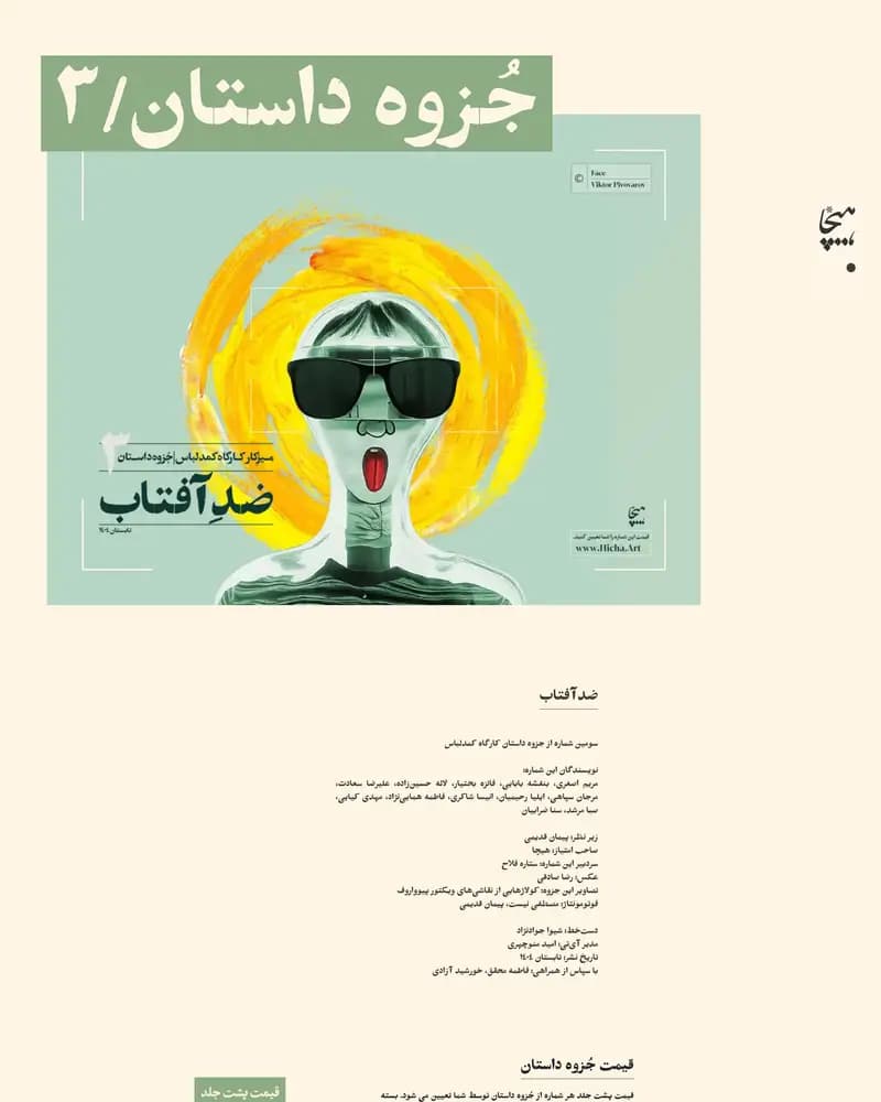
Hicha runs workshops, artistic collaborations and long-form storytelling, all of which need room. The brief asked for an experimental, minimal interface that would still carry a dense and growing content architecture — and for contemporary Persian typography to be the identity rather than a translation problem.
The practices this build came out of.
01UI/UX
02Creative development
03Motion design
Component architecture, motion on a budget
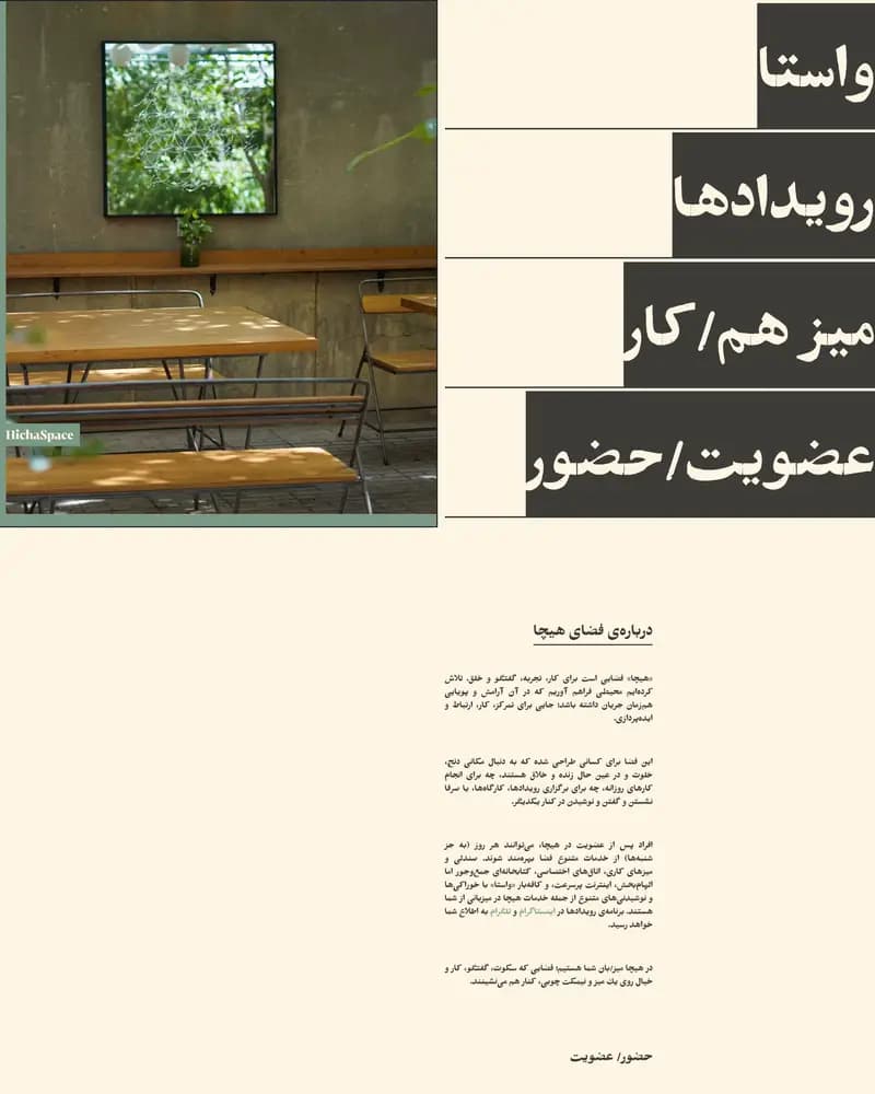
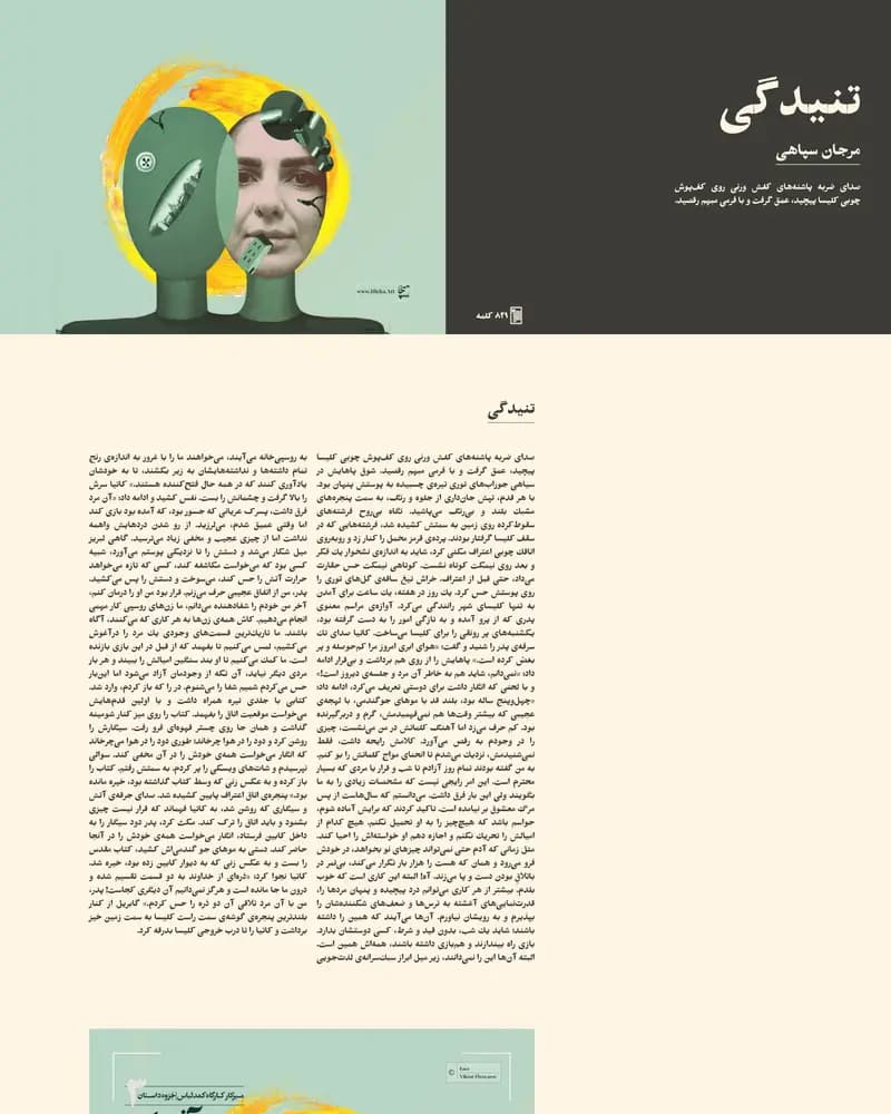
The site is a component-based Next.js and React build with a headless content layer, so new programme types can be added without a redesign. Motion is deliberate rather than decorative: smooth scrolling, page transitions and scroll-triggered reveals are tuned against performance so an interaction-heavy site still loads quickly on a phone.
Typography as the interface
Navigation is stripped back to almost nothing; asymmetric composition, a strong type hierarchy and a great deal of negative space do the organising instead. The result is a browsing experience that reads as an exhibition catalogue rather than a website menu, while remaining fully responsive.
Traffic, revenue and conversion figures belong to the client, so we do not publish them. What follows is what the delivered build contains.